Communicating with Designers: Logo Edition

Have you ever been to a foreign country without knowing their language? If you have, then you’ll know that even the difficulty of the simplest tasks begin to rival climbing Everest. You need to use the washroom, you have no idea how to ask where it is. You want to order, nobody knows what you’re talking about. There’s no doubt that it gets frustrating.
This is exactly what happens when you hire designers.
As if it wasn’t already hard enough to find the right designer, once you’ve found them, you still need to figure out how to work with them. One thing most people don’t realize is that there is a huge language barrier between employers and designers. Having gone through design school, I can tell you that there’s a whole dictionary of industry terms that you’ll never bother to learn.
Did you know that interactive usually means digital which often refers to ui/ux? Or that logo design is a subset of visual identity under a larger umbrella of branding? How about parallax, flat, or 2.0? Design is a restaurant with no menu, so how will you order?
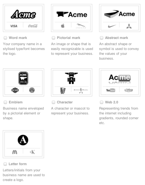
This is a huge topic, so today we’ll just go over logo design. First of all, we must look at different logo styles. In general, they’re divided into Word Mark, Pictorial Mark, Abstract Mark, Letter Form, Emblem, Character, and Web 2.0.
 The best method to communicate what you’re looking for is by providing examples. For instance, “I want it to look like the YouTube logo”, works better than you actually describing the YouTube style. It’s also important to express why you like that style in order for designers to grasp your vision. Maybe you like the YouTube logo because it’s glossy and shiny. Maybe you like it because it’s red. Providing examples is just the start, but if you can’t explain why you like something, then designers can’t design it.
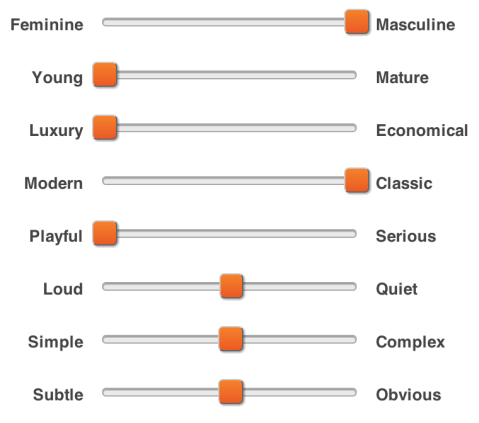
Another thing to consider is the personality of your brand. What’re your values? What should your visual identity portray? Consider thinking about where on the scale you fit in each of the brand personalities below:
Last but not least, don’t forget the most important part: Colour. Don’t just pick your favourite colour. Take into consideration what colours mean in the culture that you’re marketing to. For example, here are some common associations in western culture:
Red: Passion, Anger, Vigor, Love, Danger
Yellow: Knowledge, Energy, Joy, Intellect, Youth
Green: Fertility, Wealth, Healing, Success, Growth
White: Purity, Healing, Perfection, Clean, Virtue
Blue: Knowledge, Trust, Tranquility, Calm, Peace, Cool
Black: Fear, Secrecy, Formal, Luxury
Purple: Royalty, Wisdom, Spirituality, Imagination
Orange: Creativity, Invigoration, Unique, Stimulation
Gray: Balance, Sophistication, Neutrality, Uncommitted
Yet, at the end of the day, it’s most important to trust the designer. You obviously hired him/her because you trust them to do good work. They’re the ones with the training and the professional experience, so they probably know what’s best for your brand. Designers are creative in nature. You won’t get your money’s worth if you dictate their every move and restrict their creative freedom. After all, you are paying for creativity, aren’t you?
 Post by Michael Cheng
Michael is the Cofounder of Needle, a platform for hiring creative talent. Prior to Needle, he spent over a decade in the creative space as a freelancer, worked at agencies, and founded numerous companies providing creative services. Michael is an award-winning entrepreneur who has been featured on news publications around the world. He is a thought leader within the creative hiring space as well as an active blogger on the subject.
The Power of Visual Identity

When you’re a small business with few customers and nobody has ever heard of you, how can you grow? We talk a lot about finding early adopters, but of all the choices they have in the market, why would they trust you?
You know your business is awesome. The problem is, nobody else does.
It’s difficult to get visitors to give you their email address, even less of a chance they’ll pick up the phone to call you, and don’t even think about getting them to take out their credit card. No matter how solid your value proposition is, the fact remains, we’re all judgmental by nature.
We often deny this, but we all judge books by their covers.
Young ventures can put a stronger emphasis on visual identity to bypass trust issues. It’s all about presentation. Imagine you meet two surgeons, one dressed in scruffy torn clothes, and the other in a spotless white coat. Who will you take the surgery from?
The visual identity (branding) of your business is essentially the clothes it wears. You’ve spent so much time building its character, personality, and substance. However, for anyone to actually see those things, you’ll need to attract people with some decent clothes, too.


Here are some examples of companies you may never have heard of, but just by looking at them, you just feel like trusting them with everything you’ve got: Wallmob, Koa, Postable, Thankful
Feeling inspired? There are 13,000 brand designers on Needle, check them out!
 Posted by Michael Cheng
Michael is the Cofounder of Needle, a platform for hiring creative talent. Prior to Needle, he spent over a decade in the creative space as a freelancer, worked at agencies, and founded numerous companies providing creative services. Michael is an award-winning entrepreneur who has been featured on news publications around the world. He is a thought leader within the creative hiring space as well as an active blogger on the subject.


Recent Comments